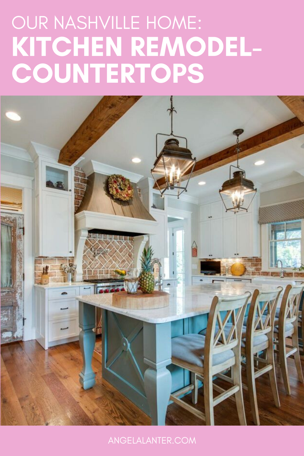
When we first bought our Nashville house, this is what the kitchen looked like…
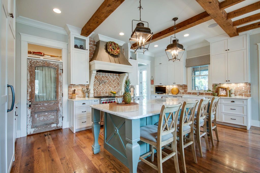
It is a beautiful kitchen. It’s just very themed. It’s very farmhouse.
If you’ve been here for awhile, you know that’s not my style. I describe my style as “Coastal Americana” and I just came up with that label for myself one day once I realized which pieces I gravitate towards.
One of the first things we did was take down the chicken wire (yes, I said chicken wire) over the pantry door. Also, the window treatments on the pantry door and kitchen window. We also switched out the super traditional, curvy legs on the island and painted the whole thing grey.
We added new lights above the island and new counter stools. We also painted the hood vent white. With all of these changes… It just still wasn’t getting it for me. It just still didn’t feel like my kitchen.
So Matt painted the brick backsplash white, with a faux Dutch schmear technique. Nope. Didn’t like it.
So, major changes had to be made.
countertops
When we bought the house, we knew we were going to need to replace the countertop on the island, at the very least. It has three large cracks running through it. That replacement was negotiated into our purchase price of the home.
I’ve never loved the countertops because of the traditional brown veins. One area (to the left of the stove) has so much brown, that there is actually green running through it. You don’t even want to know what I think it looks like… I’ll spare you.
So, the time has come to choose a new countertop. And we’re replacing them all.
We first narrowed it down to three choices…
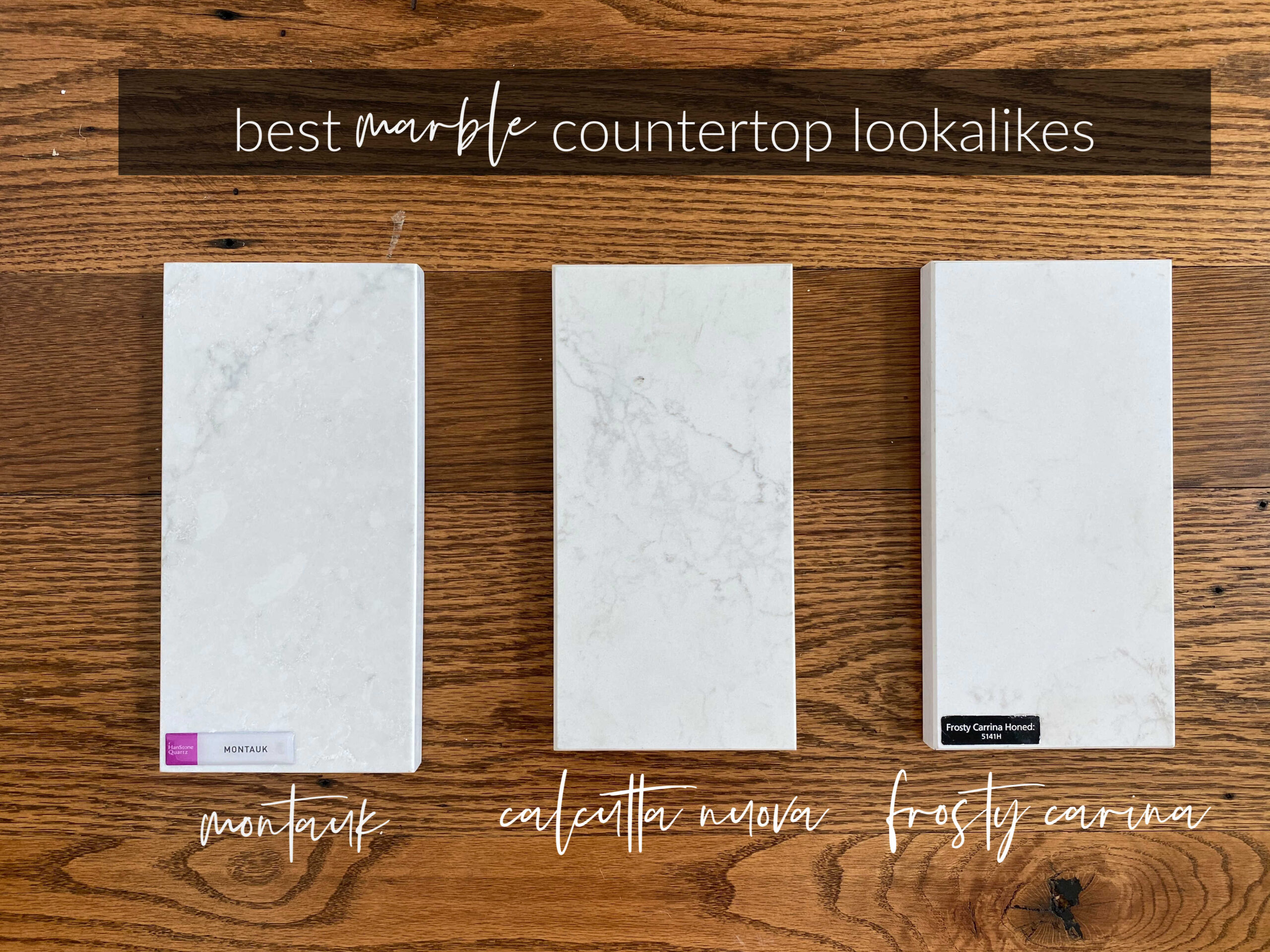
With a toddler in the house, marble was not a viable option. But I love love love the look of marble. So, caesarstone it is!
When I first laid eyes on Montauk, I fell in love. Montauk is a polished quartz and it’s positively lovely.
But Matt had his heart set on a honed finish. For those of you new to the world of countertops, honed is the opposite of polished. It’s basically a matte, smooth finish.
We narrowed it down to Calcutta Nuova and Frosty Carina. We lived with the samples in our kitchen for days. Checking the colors at all different times of day under all different lights. After days of studying the samples, we decided on Frosty Carina.
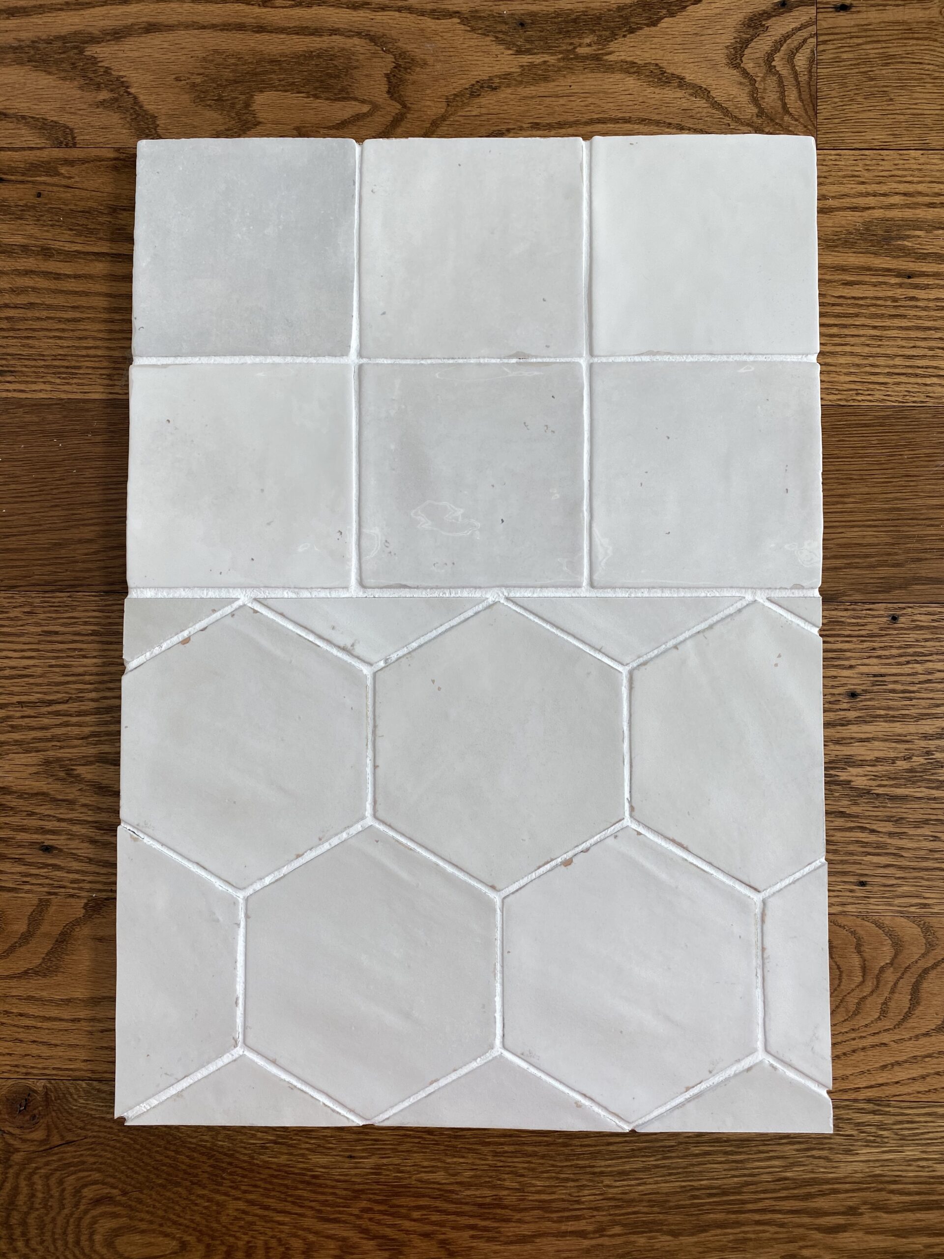
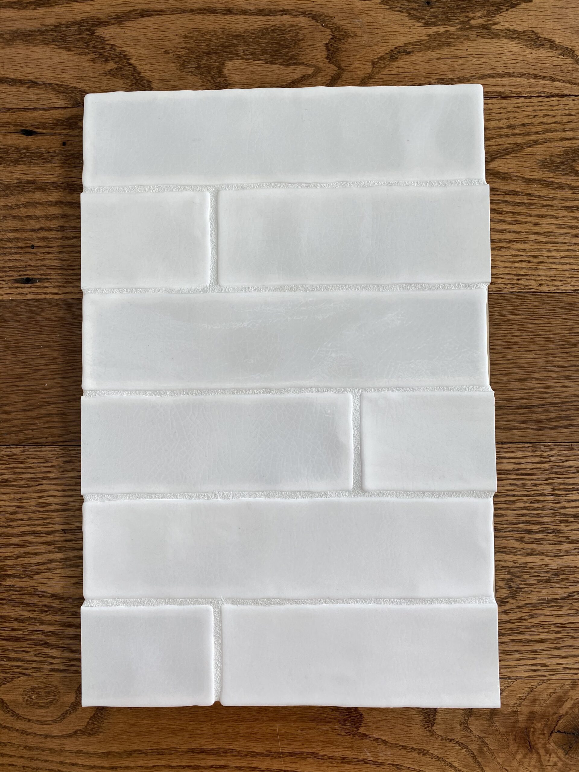
Next up is backsplash. I want to lighten the kitchen overall. Because the kitchen only has one window and it’s looking out on the covered porch, the natural light is minimal. In order to work with what we’ve got, we’re choosing all products that will brighten the space.
I’m leaning towards a 5×5″ square tile as opposed to subway tile. We had subway in our last house and I feel like everyone is doing it, so I want to choose something less popular. We’re looking at the above samples, but I’m really loving the square- not only for the shape but also the color variation. We have another brand we’re interested in, that we’ll hopefully get a sample from tomorrow. The subway tile above is Phoenix Ceramic in “Bianco” and the sample board with the square tiles is Speartek Porcelain in “Seasons Pearl”.
Next up, looking for a different style hood vent. Ours is very traditional, so looking for something with cleaner lines and just a tad more modern.
Comment below and let me know if you think I should go with square tiles on the backsplash or if you prefer something else.




 . Once we finish our back yard remodel it’s the next on the list.
The square tiles! I’ve always loved those!
I get what you mean, by choosing the less popular option.
I hate a copy paste house all around town